Problem & Solutions
Manually creating ramps is frustrating, slow, and often inconsistent. Even advanced tools make you choose systems, tweak scales, and manage variables on your own.

Tired of Wrestling With Colors?

How It Works

How Pencil Color Fits Into Your Workflow

No steep learning curve. Just pick a color, click a button, and PencilColor does the rest  ramps, themes, accessibility, and exports, all inside Figma.
1

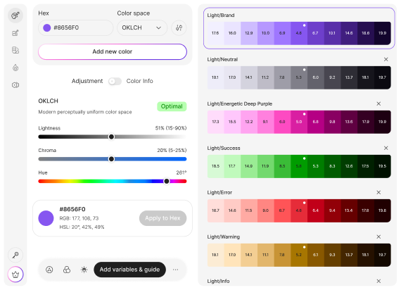
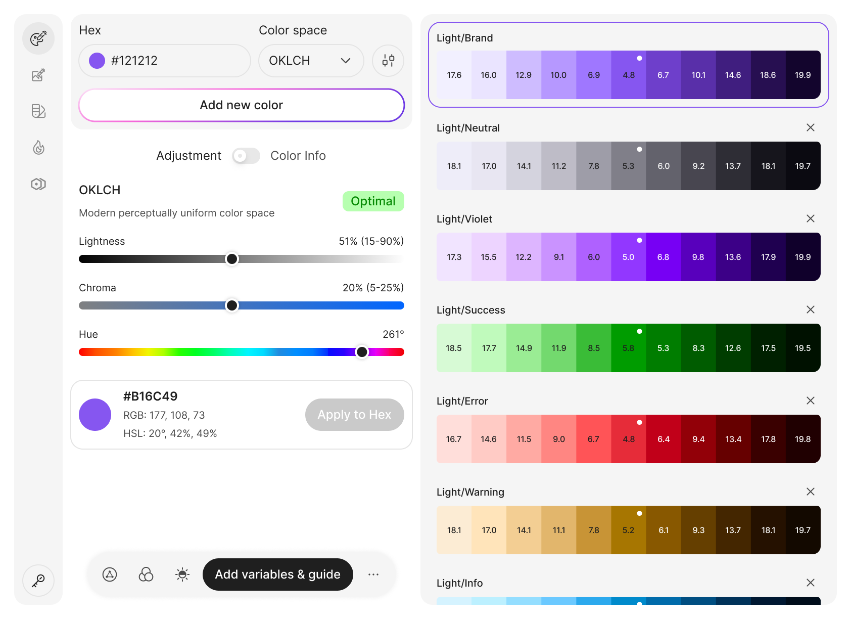
Pick Your Base Color

Start with any color Enter a hex or pick a color. Choose OKLCH (recommended).
2

Refine & Validate

Adjust lightness/chroma globally. PencilColor checks WCAG/APCA and flags gamut issues.
3

Generate & Export

Create variables & Style guide. Variables, ramps (50–950), badges, and usage examples.
Features

Why Designers & Developers Love PencilColor?

Everything you need to create consistent, accessible color systems  without the hassle of manual tweaking.

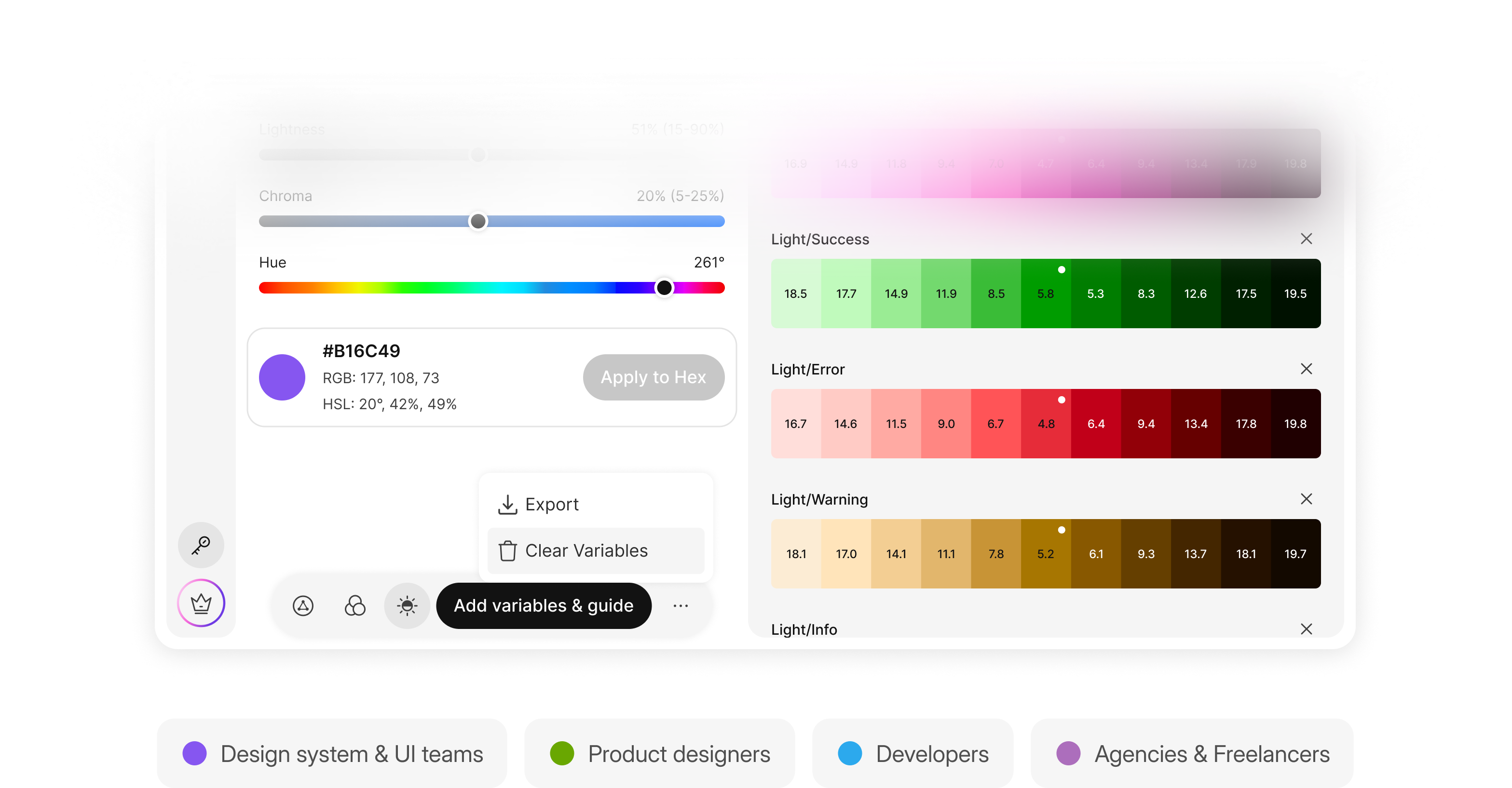
Smart palette generation

Evenly spaced OKLCH ramps that stay gamut-safe, with adaptive chroma at each step.

Harmony system

Generate complementary, triadic, split-complementary, or tetradic variants with full ramps.

Functional, neutral, brand & custom

Includes system colors, professional neutral scales, brand primaries, and unlimited custom ramps.

Theme management

Create consistent light and dark themes with matching step logic and smooth transitions.

Accessibility (WCAG/APCA)

See real-time contrast results with automatic suggestions for the best text colors.

Intelligent naming

Names reflect hue, lightness, and chroma; choose Descriptive, Brand, or Technical style options.

Advanced controls

Adjust global lightness, contrast, and chroma with full OKLCH sliders and toggles.

Variables & style guide (Figma‑native)

Auto-generate organized variables, swatches, contrast badges, and ready-to-use style guides.

Exports & output

Export CSS/SCSS, JSON, Tailwind, Shadcn, iOS, Android XML, or copy OKLCH variables directly.
Coming Soon graphic with a gradient background. Features buttons for Color library, Design system, Pencilcolor AI, Token studio, & More.
Coming Soon graphic with feature buttons: Color Library, Design System, Pencilcolor AI, Token Studio, & More.
Who it’s for

Designed for Designers & Developers

Perfect for design systems, product teams, developers, and agencies who need scalable palettes and tokenized outputs. Loved by both designers and engineers.
Color palette design interface with color swatches and user roles.
FAQ

Got Questions About PencilColor?

We’ve answered the most common ones below so you can start designing with clarity and confidence.

Do I have to use OKLCH?

No. We recommend it for visual consistency, but you can also start from familiar inputs; PencilColor handles conversions.

Will colors be accessible?

We surface WCAG/APCA badges and help you tune lightness/chroma until they pass.

What if a color is out of gamut?

We flag it and apply gamut‑aware mapping.

Can developers use the outputs directly?

Yes, export CSS/SCSS/JSON/Tailwind/Swift/Android.

What happens if I change variables later?

The style guide stays linked to your primitives; updates flow through.